Founded in 1957, VINEX is one of India’s most respected and long-standing manufacturers of sports and fitness equipment. With a legacy spanning over six decades, VINEX has built a reputation for quality, reliability, and performance—serving both professional athletes and fitness enthusiasts across India and international markets.
Our Contribution
As VINEX approached a new era of expansion and brand relevance, we partnered with them to revamp their visual identity and modernize their packaging system—bringing continuity to their heritage while aligning with contemporary expectations.
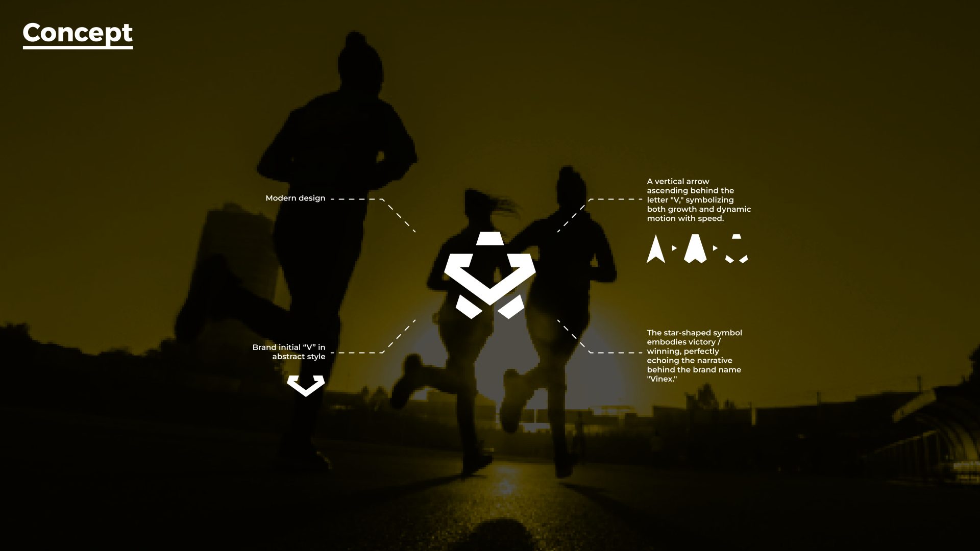
We reimagined their logo from its classic form into a bold, geometric mark that captures the spirit of motion, precision, and victory. The new symbol cleverly integrates the brand’s initial ‘V’, forming a star-like figure that represents winning, while the upward arrow reflects growth and athletic progress. This modern identity retains the core values of the brand—discipline, endurance, and consistency—while making it future-ready.
Result
The brand transformation gave VINEX a contemporary edge without losing its legacy. The revamped identity and packaging helped reinforce trust among existing customers while making the brand more appealing to a younger, urban, and global audience—positioning VINEX for its next chapter of growth.
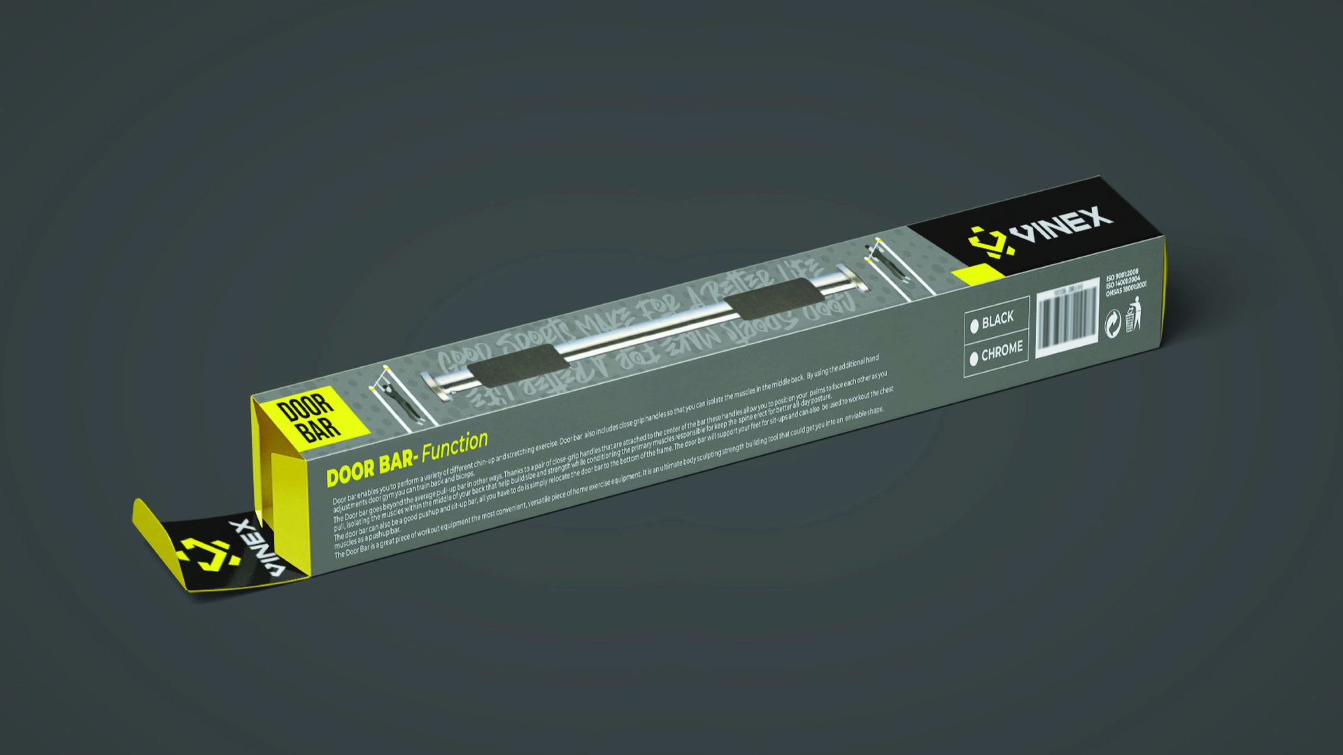
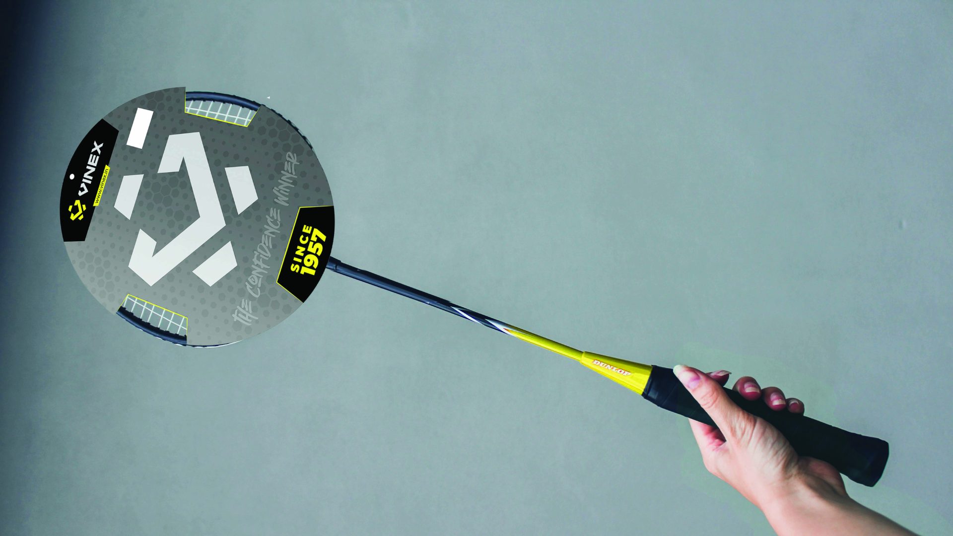
In addition, we developed packaging design solutions across product lines—from fitness accessories like door bars to professional badminton equipment. The new packaging system balances functionality and visual impact, featuring a high-contrast color scheme, clean typography, and structural clarity—ensuring strong retail visibility and user-friendly communication.