Si14 is a leading brand in silicon microchip manufacturing, known for its high-performance chips. Utilizing the latest technologies, it delivers innovative solutions across industries like electronics, automotive, and telecommunications.
Why the mark works
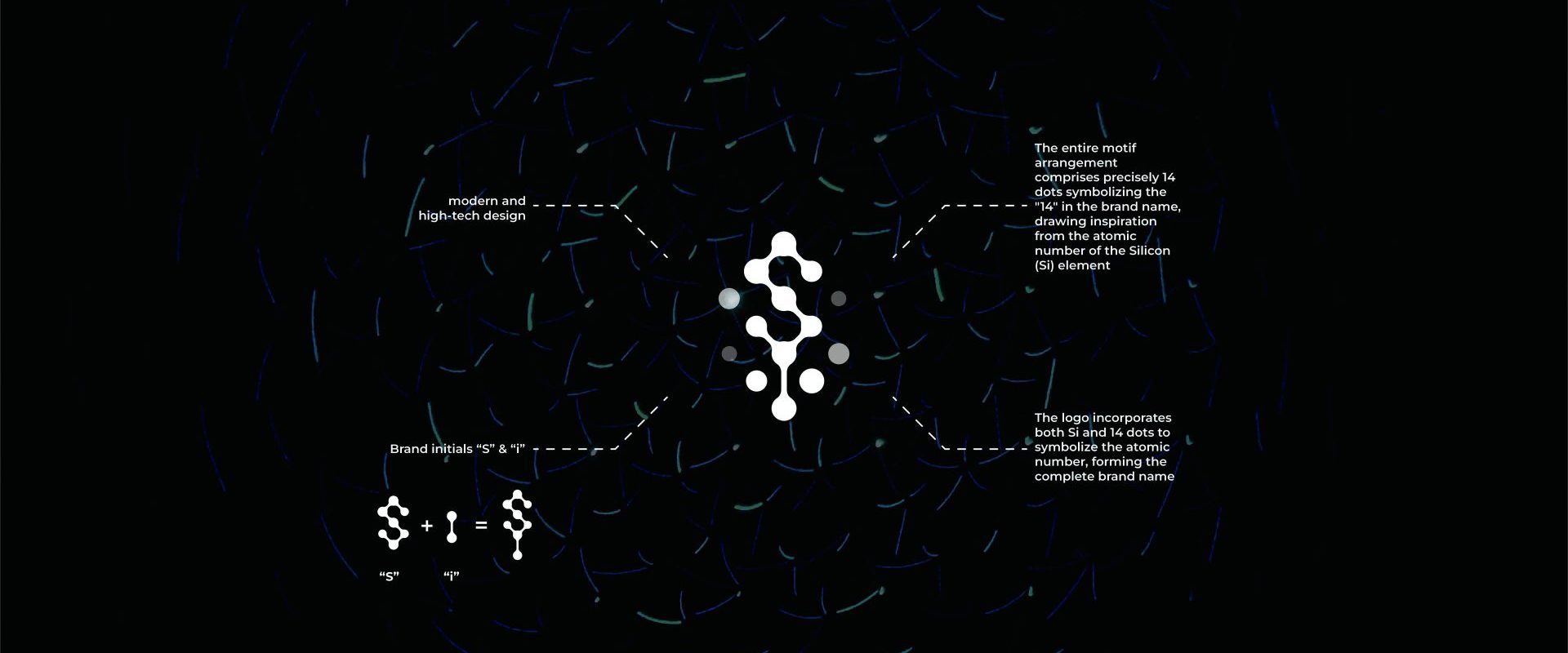
The symbol joins the brand initials “S” and “i” into a single form built from connected dots, which gives it a modern, high-tech character suited to semiconductors. The full motif uses precisely 14 dots, a reference to the “14” in the brand name, which draws its inspiration from the atomic number of silicon (Si). The logo therefore carries the whole brand name: “Si” in its shape and “14” in its dot count. The idea comes straight from the material the company works with, so the mark is tied to Si14 and its business rather than to semiconductors in general.
What we delivered
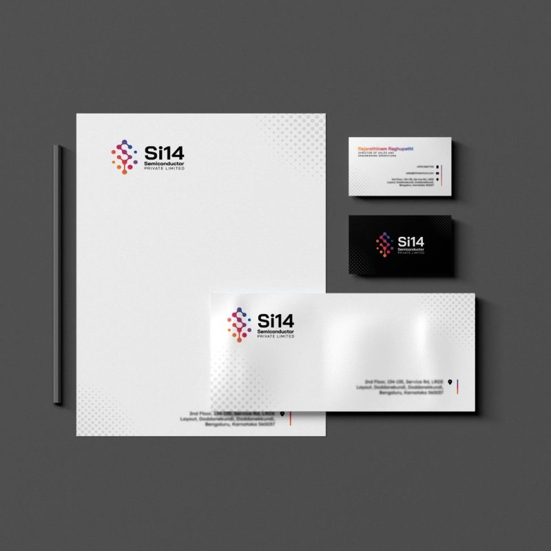
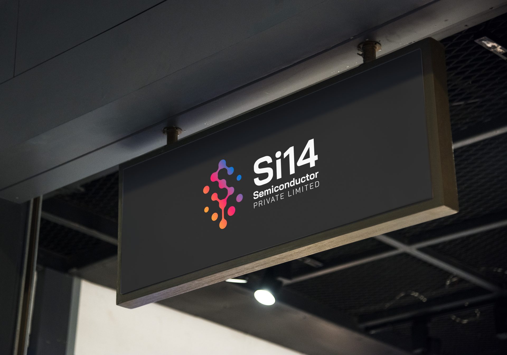
The Si14 logo symbol and wordmark, plus graphic design applications shown on this page: letterhead, business cards, envelope and a signage application. See how we approach identity projects on our brand identity agency in India page.